Jazz
Indie
Pop
Rock
R&B
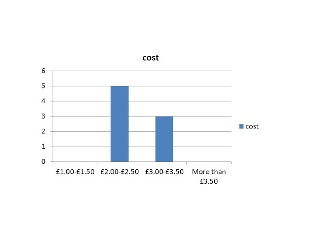
2. What would you be willing to pay for my music magazine?
£1.00-£1.50
£2.00-£2.50
£3.00-£3.50
More than £3.50
3. Would you buy the magazine?
Never
Weekly
Monthly
4. Could I improve my magazine? (if yes… how)
(If no… what do you think works?)
Thank you for your feedback J
“I think the photograph on the front cover is good because she is looking into the camera. I also like the colour scheme used”
“I like the colour scheme and the layout of the pages. The images are really good, and the double page spread layout is very good”
“I like the masthead and skyline and the house style colours. I like the title in the contents page with red background behind it. There could be more features in the left third and there is a gap in the middle of DPS- love the photos though!”
“You could have made the main feature bigger so it stands out more, or made the smaller features smaller”
“On the contents page you could have put a subscription in order for your readers to continue to buy the following editions.”
“I like the colour scheme and placement of the text on the front cover and the contents page, however I don’t think the heavy one of the dark colour works as well”
“Bigger writing on the DPS but less of it and larger images. Front cover- splash around the win! So that it stands out more”
“You could improve the front cover by making the text more on the left, other than that, I really like the magazine”
I agree about majority of the feedback comments as I feel I could of added or changed the writing within the magazine “You could improve the front cover by making the text more on the left”. I have also taken into consideration about the images on the DPS as they are dark “I don’t think the heavy one of the dark colour works as well”. I could have added a subscription on my contents page and also changed the size of the subtitle features, “On the contents page you could have put a subscription in order for your readers to continue to buy the following editions.”
however the gap on the DPS is so I know where the fold would be if produced into a music magazine, I am pleased with my feedback as most of the audience made correct answers within the music magazine. “Bigger writing on the DPS but less of it and larger images. Front cover- splash around the win! So that it stands out more”


Javanna, please post all your final designs.
ReplyDelete